Sunday, 25 April 2010

Change of idea?

I have been experimenting with colour as a close up and these images are what I have taken for an experimentation for a new idea


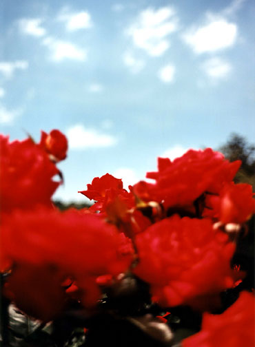
I have been using my Canon Digital Camera to take some photographs outside of flowers to experiment using colour.

I think that these images have worked well as the colours appear vibrant and the compositions have been thought out well before i took the shot.
I like the idea of incorporating some of the surroundings within the composition.
I feel that this idea helps to break up the negative and positive space within an image. The shots I like in this contact print are of the yellow flowers and the white and pink flowers.

This contact print has been created with a series of shots I had taken after the first shots. I dont think that the daffodil images have worked as well as the additional flowers underneath as the concept hasnt been thought out as well as the others.

I like the colours in the dafodils and feel that these shots would have worked better if the dafodils were outside in their natural habitat; this would have allowed me to use the natural lighting from the sun.

Saturday, 24 April 2010

Terri Weifenbech


Additional Draft

I have previously posted a blog showing two designs in a landscape view.


For this next draft i have chosen to make the poster in a portrait view to experiment with the two different approaches.
I chose to use a different colour as the main background for this poster as I wanted to see how a black background would work with a white font style and a number of different colour photographs.
I think that this idea has worked well; the white font doesnt draw all the attention towards this area, although the information is important for the viewer as it states the name of the exhibition, contact details, times and dates of viewing and address of venue.
As I have done previously, i like the idea of incorporating a photograph into the background with a low opacity level. I think it gives the whole poster an interesting appearance.
I have chosen a number of colour photographs focussing on close up nature and also one black and white portrait. I could in theory balance out the number of portraits and nature images to give the poster a better view on what the publis will be viewing at the exhibition.
Could people give their opinions on this poster and my previous ones?
Many thanks.


Poster Design Drafts

This is my first draft for my personal exhibition poster. I have studied a number of existing exhibition posters and have used a red background as the main colour.
I think that this colour works well with the block colours towards the right hand side of the poster.
The brush stamp that i used towards the bottom of the poster adds an interesting feature to the poster and i feel that it helps to break up the red within the composition.
I used a simple yet effective white font style as I wanted it to be seen easily. It also immediately draws the attention of the viewer as white stands out almost instantaneously.

I need to add a few more details onto this poster however as this was a draft i will add the other important information onto another draft poster.
Also i have included another photograph in the background underneath the red. I have adapted the opacity of this image so it does not draw much attention towards this point.

This second draft has been created using a different background colour; the purple is abit more dramatic than the red. However i do feel as though the red works better with the colour scheme i have chosen.
I chose to use an all black font for this poster as I felt it would draw too much attention towards the other information in comparison to the main title.
I dont think that the black font has worked particulary well in this draft and I have chosen to opt for an all white font style for my final design dependant on the background colour choice.

Friday, 23 April 2010

Font Styles

These are my fonts that I have selected for this project in designing the poster
I will be working these a number of these fonts as i feel they are the best ones to use for the poster design.
I wanted to choose a clean, and simple text as these fonts draw the attention of the viewer instantaneously; i have discovered that font style is an important aspect of a poster.

Friday, 16 April 2010

Poster Designs

I have been looking into a series of poster designs on the internet to get some inspiration for my own poster for the exhibition.
I have found a number of exhibition posters which I am going to analyse.
I will be drafting some posters and trying out a series of different colour variations and images for each design.
I might opt for either a landscape or portrait design.
Also i will be including images of my own work and working around this idea
to decide on colour schemes etc.
Once i have drafted a few designs I will upload them onto the blog.

Tuesday, 30 March 2010

Contact sheet of Experimentation 2

This is the second contact sheet I have produced to show a better use of experimentation

This contact sheet relfects the work of painting. I wanted to photograph a series of different tools which all relate to one area.
I think that this experimental shoot has worked well, however I may need to make some adjustments to the contrasts in Photoshop if I decide to use a number of these shots for the final prints.
I have tried to emphasise the idea of painting in an interesting matter; and i feel that the idea of photographing seperate elements has helped me to create this idea.

Saturday, 27 March 2010

First contact sheet of Experimentation!

This is my first contact sheet for this project. I have been playing around with black and white and using the depth of field technique to focus on the areas I want the eye to be drawn to.
I also wanted to make sure that the ideas behind the photographs were displayed through the image.
For example, the monopoly game represents play.
another example would be the keyboard, also reflecting play or a hobby - music.

Thursday, 18 March 2010

Testers

This is the first of the images I have taken for this project experimenting with depth of field using monochrome with a digital camera.

I like this one as it shows a emphasis of black and white contrasts and reflects the idea of working. The idea of working has been indicated by the laptop. I would like to show a number of different working activities within my photographs.


This is another interesting concapt, i was able to photograph this subject matter whilst the piece of paper was being held. This indicates an activity of reading and working, hense the work book on the table. I used depth of field in this photograph focussing on the bangle on the subject matters wrist.

I feel that this photograph indicates play as the shot was taken during a game of monopoly. I wanted to make sure i captured the main subjects within one frame which would allow the audience to realise what game has been photographed in play.
I like this one as the contrasts of black and white are strong and make the main focus has been drawn to the horse counter in the middle of the frame.


I think that this photograph has been created really well using the idea of depth of field.
The focus has been drawn to the pages of the paper pad and therefore represent the idea of basing the whole composition around this area.

Monday, 15 March 2010

Idea!

So .. i have decided to work on depth of field ! Focussing on black and white with digital :)

Just need my digital camera now!!!
x