Tuesday 11 May 2010

Final Presentation

Final Images
I have chosen to get my final prints printed on 10 by 8 photographic paper.
I have received these back and I am pleased with the final result.
I chose to show my final images as seperate prints and I decided against creating a book or putting them into a professional final presentation box.
I managed to combine 10 - 12 final images together to show the intention i wanted for this project.
I like the way I have been able to enhance an image
to make it more realistic to the human eye.
Although a digital camera captures an image as it is in real form, i chose to enhance the colours within the final images to make them appear to be more intriging to the eye.
Written work has now been completed;
i will be looking through incase any adjustments and amendments are needed.
x

Thursday 6 May 2010

Additional Contact Print

For this contact print I wanted to work on depth of field. I also experimented with my Macro Lens and I am pleased with a number of results.
I like the vibrancy of the pink which is drawn out of the flowers.
The blurred background helps me to achieve an interesting concept and I love the idea of focussing on the centre of the flower and then another shot focussing on the petals.
I have realised that; from this contact print, that the shots which work best focus on the centre of the flower.

Tuesday 4 May 2010

Final Images

I have been shooting on digital for a while now producing a series of
different images on the idea I was working on.
I bought a Macro lens last week so I took a few shots with that and now have 10 final images which will be printed.
I have decided to keep the final prints as a individual basic print as
i dont want to over complicate the idea behind
the photographs.

Tuesday 27 April 2010

Additional Edits

The edited images will be the ones i choose to get printed for this project


This is the original photo


And this is the edited version;
As you can tell from the above image, the edited image has been edited in a noticeable way.
I have changed the colour of the surrounding area around the daffodil as I felt the previous image lacked colour; i think that this edit has helped to enhance the whole composition.
I have also managed to enhance the colour of the yellow and green on the daffodil.
With some simple techniques in changing the appearance of this image I feel as though I have been able to make the photograph more appealing.


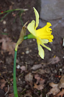
I decided against using the 'Auto Colour' option for this photograph as the image afterwards appeared too blue.
I think that although I have made some changes to the original image, the flower still appears natural.
I also used the 'Image-Adjustments-Brightness and Contrast' to make
the whole image stand out more

This is the original photo


And this is the edited version;

From looking at these images from a distance, there isn't much change that it noticeable.
However I have made some adjustments to the 'Brightness and Contrast' within the image which has helped to draw the flower closer to the foreground of the composition.
I have also used the clone stamp to remove some dirt from the outline of the flower. This has enabled me to create a cleaner composition.
I decided to enhance the colour of green within the image as I felt this area needed to be made more evident in the whole composition.
The depth of field I have used here foccuses on the orchid in the foreground of the composition.
The green grass in the background is blurred to give the composition an interesting effect.

I think that this one works well and related so my research by Terri Weifenbach.
The idea of using minimal whiteness in the background helps draw the viewer closer towards the flower.

Monday 26 April 2010

A few edits

This image is the original photo


This is the edited photo.


I used Photoshop cS3 to make some edits to the original images, i wanted to enhance the colours within the composition.
To do this i used the 'Image - Adjustments - Curves..' tool.
This enabled me to make the flower brighter and the background darker. I wanted the flower to stand out almost instantaneously.


The colours in the background have also been enhanced.
To do this i went to 'Image - Adjustments - Auto Color'. I then selected 'Colour Balance' which allowed me to add a hue of red in the background.

This is the original image


This is the edited image below;
For this edit in Photoshop i decided to use some of the same techniques i used for the previous edit. I liked the idea of making the flower stand out more against the background so i implied the same technique here. However I have added a pink hue to the magenta within the image on this one.
The grass has also been edited to make the green more vibrant; i did this by selecting 'Images - Adjustments - Color Balance' and adding some colour to the highlights and shadows within the composition.

The original image lacked vibrancy within the colour of the flower and i wanted to enhance the vibrancy which I feel i have been able to acheive.


Edit to Previous Poster Design

This is my edit for the previous poster design i had made for this project.
I took on board the comment i had in regard to this poster design and have changed the selection of images to all colour focussing on flowers using depth of field.

I would appreciate peoples opinions on this one as this could be a possibility for my final design.


This is the draft for our whole exhibition poster below:


The small boxes underneath the large image indicates where the smaller images will go from each student.
I like this idea as it is clean and simple and has a balance of both positive and negative space which makes the whole poster more appealing.

Sunday 25 April 2010

Contact Prints


Contact Prints


Experimentation 2

These next contact prints have been shot today with minimulistic sunlight; which restricts the natural light i had.
I wanted to photograph a number of flowers within one area to show different colours and compositions.
I wanted to capture the weather within these shots, given the idea of focussing on the water droplets in some of the image.
I think this idea has been expressed well, however i feel that it works better on the green plants rather than the colourful flowers.

With the camera lens that I was using; a standard 55mm lens I wasn't able to get as close to the subject matter as I had hoped. Although i do feel as though I was able to shoot a good range of images using the technique of depth of field.

The purple orchid and pink flowers have worked best to show a variation of different colours within this contact print.
I like the depth of field used on the pink flowers as it shows how delicate each flower is.
On a closer look, i can see how detailed the shots are; the pink flowers have a formation of a heart which helps to give these flowers a more interesting meaning.

Opinions?

Change of idea?

I have been experimenting with colour as a close up and these images are what I have taken for an experimentation for a new idea


I have been using my Canon Digital Camera to take some photographs outside of flowers to experiment using colour.

I think that these images have worked well as the colours appear vibrant and the compositions have been thought out well before i took the shot.
I like the idea of incorporating some of the surroundings within the composition.
I feel that this idea helps to break up the negative and positive space within an image. The shots I like in this contact print are of the yellow flowers and the white and pink flowers.

This contact print has been created with a series of shots I had taken after the first shots. I dont think that the daffodil images have worked as well as the additional flowers underneath as the concept hasnt been thought out as well as the others.

I like the colours in the dafodils and feel that these shots would have worked better if the dafodils were outside in their natural habitat; this would have allowed me to use the natural lighting from the sun.

Saturday 24 April 2010

Terri Weifenbech


Additional Draft

I have previously posted a blog showing two designs in a landscape view.


For this next draft i have chosen to make the poster in a portrait view to experiment with the two different approaches.
I chose to use a different colour as the main background for this poster as I wanted to see how a black background would work with a white font style and a number of different colour photographs.
I think that this idea has worked well; the white font doesnt draw all the attention towards this area, although the information is important for the viewer as it states the name of the exhibition, contact details, times and dates of viewing and address of venue.
As I have done previously, i like the idea of incorporating a photograph into the background with a low opacity level. I think it gives the whole poster an interesting appearance.
I have chosen a number of colour photographs focussing on close up nature and also one black and white portrait. I could in theory balance out the number of portraits and nature images to give the poster a better view on what the publis will be viewing at the exhibition.
Could people give their opinions on this poster and my previous ones?
Many thanks.


Poster Design Drafts

This is my first draft for my personal exhibition poster. I have studied a number of existing exhibition posters and have used a red background as the main colour.
I think that this colour works well with the block colours towards the right hand side of the poster.
The brush stamp that i used towards the bottom of the poster adds an interesting feature to the poster and i feel that it helps to break up the red within the composition.
I used a simple yet effective white font style as I wanted it to be seen easily. It also immediately draws the attention of the viewer as white stands out almost instantaneously.

I need to add a few more details onto this poster however as this was a draft i will add the other important information onto another draft poster.
Also i have included another photograph in the background underneath the red. I have adapted the opacity of this image so it does not draw much attention towards this point.

This second draft has been created using a different background colour; the purple is abit more dramatic than the red. However i do feel as though the red works better with the colour scheme i have chosen.
I chose to use an all black font for this poster as I felt it would draw too much attention towards the other information in comparison to the main title.
I dont think that the black font has worked particulary well in this draft and I have chosen to opt for an all white font style for my final design dependant on the background colour choice.

Friday 23 April 2010

Font Styles

These are my fonts that I have selected for this project in designing the poster
I will be working these a number of these fonts as i feel they are the best ones to use for the poster design.
I wanted to choose a clean, and simple text as these fonts draw the attention of the viewer instantaneously; i have discovered that font style is an important aspect of a poster.

Friday 16 April 2010

Poster Designs

I have been looking into a series of poster designs on the internet to get some inspiration for my own poster for the exhibition.
I have found a number of exhibition posters which I am going to analyse.
I will be drafting some posters and trying out a series of different colour variations and images for each design.
I might opt for either a landscape or portrait design.
Also i will be including images of my own work and working around this idea
to decide on colour schemes etc.
Once i have drafted a few designs I will upload them onto the blog.

Tuesday 30 March 2010

Contact sheet of Experimentation 2

This is the second contact sheet I have produced to show a better use of experimentation

This contact sheet relfects the work of painting. I wanted to photograph a series of different tools which all relate to one area.
I think that this experimental shoot has worked well, however I may need to make some adjustments to the contrasts in Photoshop if I decide to use a number of these shots for the final prints.
I have tried to emphasise the idea of painting in an interesting matter; and i feel that the idea of photographing seperate elements has helped me to create this idea.

Saturday 27 March 2010

First contact sheet of Experimentation!

This is my first contact sheet for this project. I have been playing around with black and white and using the depth of field technique to focus on the areas I want the eye to be drawn to.
I also wanted to make sure that the ideas behind the photographs were displayed through the image.
For example, the monopoly game represents play.
another example would be the keyboard, also reflecting play or a hobby - music.

Thursday 18 March 2010

Testers

This is the first of the images I have taken for this project experimenting with depth of field using monochrome with a digital camera.

I like this one as it shows a emphasis of black and white contrasts and reflects the idea of working. The idea of working has been indicated by the laptop. I would like to show a number of different working activities within my photographs.


This is another interesting concapt, i was able to photograph this subject matter whilst the piece of paper was being held. This indicates an activity of reading and working, hense the work book on the table. I used depth of field in this photograph focussing on the bangle on the subject matters wrist.

I feel that this photograph indicates play as the shot was taken during a game of monopoly. I wanted to make sure i captured the main subjects within one frame which would allow the audience to realise what game has been photographed in play.
I like this one as the contrasts of black and white are strong and make the main focus has been drawn to the horse counter in the middle of the frame.


I think that this photograph has been created really well using the idea of depth of field.
The focus has been drawn to the pages of the paper pad and therefore represent the idea of basing the whole composition around this area.

Monday 15 March 2010

Idea!

So .. i have decided to work on depth of field ! Focussing on black and white with digital :)

Just need my digital camera now!!!
x

Thursday 11 March 2010

Research 2

Depth of Field on location
I chose to research a series of photographs which related to the type of work I wanted to reflect.
I like the photograph as a form of research as I feel as though the depth of field used within this composition reflects the image as a whole concept.
The chess piece towards the foreground is in sharp focus and therefore acts as an important point.
The use of black to white contrasts makes a dramatic impact on the whole composition.
If the viewer looks closer within the image we can see that two chess pieces are positioned on the keys of a piano. This creates some diversity and therefore makes the image more interesting.

I like this photograph as it creates an atmosphere on the whole image. The shot has been taken side on, and therefore makes the image more interesting.
I have become aware that, through my research that the angle of the shot has a big impact on how the viewer see's the overall image.


Wednesday 10 March 2010

Research

So this is the start of my research based on the ideas I have been looking at:


Recording movement and still in Black and White Digital:

I wanted to find some research which contained a main focus point and a familiar angle on society. I really like the above photograph as I feel the depth of field has been focussed on the most important part of the composition.
The hands appear old; the reason i think this, is that the veins of the hands have been captured and give a sense of oldness to the image.
I think that the piano works well within this photograph, suggesting that the person isn't too old to play a piano.
The contrasts on the hand in the foreground give a good atmosphere to the whole composition.
I feel I need to work on this area as experimentation to see if adding a series of different elements enhances a photograph.


Ideas:

So i thought i would put some ideas out here so I can decide what i want to do for this project..

  • Reflections
  • Depth of Field at home.
  • Depth of Field on location.
  • Recording Activities in Black and White digital.
  • Natural Portraiture
  • Architecture
  • Fashion
  • Social Documentary

I'm thinking of using digital for this project as the process of gaining ideas will be more efficient than using a medium format camera.

I may decide to steer away from using digital, and working towards medium format incase the idea I decide to work with, works better with medium format.
Research here i come!

x

Monday 1 March 2010

Intro

Hi all.

So this is my new blogspot blog.
Over the next couple of months i will be adding a series of blogs to record the progess of this project. As it stands, I havent decided what aspect of photography i will be working on, however as I gain some inspiration from research and other sources I will be able to find something that I will be working on over the next few months.

This blog has been designed to produce a series of reports and images. I will be doing this to gather feedback on my progress and shoots from other blog users for this porject.
These critiques will be an important aspect of this blog as it will help me to work on aspects which need to be improved to create a good variety of imagery.

Bye for now!
x