


And this is the edited version;
From looking at these images from a distance, there isn't much change that it noticeable.
However I have made some adjustments to the 'Brightness and Contrast' within the image which has helped to draw the flower closer to the foreground of the composition.
I have also used the clone stamp to remove some dirt from the outline of the flower. This has enabled me to create a cleaner composition.
I decided to enhance the colour of green within the image as I felt this area needed to be made more evident in the whole composition.
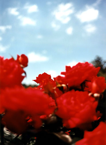
The depth of field I have used here foccuses on the orchid in the foreground of the composition.
The green grass in the background is blurred to give the composition an interesting effect.
I think that this one works well and related so my research by Terri Weifenbach.
The idea of using minimal whiteness in the background helps draw the viewer closer towards the flower.


This is the edited image below;
For this edit in Photoshop i decided to use some of the same techniques i used for the previous edit. I liked the idea of making the flower stand out more against the background so i implied the same technique here. However I have added a pink hue to the magenta within the image on this one.
The grass has also been edited to make the green more vibrant; i did this by selecting 'Images - Adjustments - Color Balance' and adding some colour to the highlights and shadows within the composition.
The original image lacked vibrancy within the colour of the flower and i wanted to enhance the vibrancy which I feel i have been able to acheive.

This is my edit for the previous poster design i had made for this project.
I took on board the comment i had in regard to this poster design and have changed the selection of images to all colour focussing on flowers using depth of field.
I would appreciate peoples opinions on this one as this could be a possibility for my final design.


These next contact prints have been shot today with minimulistic sunlight; which restricts the natural light i had.
I wanted to photograph a number of flowers within one area to show different colours and compositions.
I wanted to capture the weather within these shots, given the idea of focussing on the water droplets in some of the image.
I think this idea has been expressed well, however i feel that it works better on the green plants rather than the colourful flowers.

With the camera lens that I was using; a standard 55mm lens I wasn't able to get as close to the subject matter as I had hoped. Although i do feel as though I was able to shoot a good range of images using the technique of depth of field.

The purple orchid and pink flowers have worked best to show a variation of different colours within this contact print.
I like the depth of field used on the pink flowers as it shows how delicate each flower is.
On a closer look, i can see how detailed the shots are; the pink flowers have a formation of a heart which helps to give these flowers a more interesting meaning.
Opinions?

I have been using my Canon Digital Camera to take some photographs outside of flowers to experiment using colour.
I think that these images have worked well as the colours appear vibrant and the compositions have been thought out well before i took the shot.
I like the idea of incorporating some of the surroundings within the composition.
I feel that this idea helps to break up the negative and positive space within an image. The shots I like in this contact print are of the yellow flowers and the white and pink flowers.
This contact print has been created with a series of shots I had taken after the first shots. I dont think that the daffodil images have worked as well as the additional flowers underneath as the concept hasnt been thought out as well as the others.
I like the colours in the dafodils and feel that these shots would have worked better if the dafodils were outside in their natural habitat; this would have allowed me to use the natural lighting from the sun.

This is my first draft for my personal exhibition poster. I have studied a number of existing exhibition posters and have used a red background as the main colour.
I think that this colour works well with the block colours towards the right hand side of the poster.
The brush stamp that i used towards the bottom of the poster adds an interesting feature to the poster and i feel that it helps to break up the red within the composition.
I used a simple yet effective white font style as I wanted it to be seen easily. It also immediately draws the attention of the viewer as white stands out almost instantaneously.
I need to add a few more details onto this poster however as this was a draft i will add the other important information onto another draft poster.
Also i have included another photograph in the background underneath the red. I have adapted the opacity of this image so it does not draw much attention towards this point.

This second draft has been created using a different background colour; the purple is abit more dramatic than the red. However i do feel as though the red works better with the colour scheme i have chosen.
I chose to use an all black font for this poster as I felt it would draw too much attention towards the other information in comparison to the main title.
I dont think that the black font has worked particulary well in this draft and I have chosen to opt for an all white font style for my final design dependant on the background colour choice.


