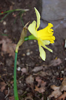
This is the original photo
I have changed the colour of the surrounding area around the daffodil as I felt the previous image lacked colour; i think that this edit has helped to enhance the whole composition.
I have also managed to enhance the colour of the yellow and green on the daffodil.
With some simple techniques in changing the appearance of this image I feel as though I have been able to make the photograph more appealing.

I think that although I have made some changes to the original image, the flower still appears natural.
I also used the 'Image-Adjustments-Brightness and Contrast' to make
the whole image stand out more
And this is the edited version;
From looking at these images from a distance, there isn't much change that it noticeable.
However I have made some adjustments to the 'Brightness and Contrast' within the image which has helped to draw the flower closer to the foreground of the composition.
I have also used the clone stamp to remove some dirt from the outline of the flower. This has enabled me to create a cleaner composition.
I decided to enhance the colour of green within the image as I felt this area needed to be made more evident in the whole composition.
The depth of field I have used here foccuses on the orchid in the foreground of the composition.
The green grass in the background is blurred to give the composition an interesting effect.
I think that this one works well and related so my research by Terri Weifenbach.
The idea of using minimal whiteness in the background helps draw the viewer closer towards the flower.


No comments:
Post a Comment